OTL AICHER
February - May 2021
A 5-part semester-long exploration of my design hero, German graphic designer Otl Aicher. With self-generated research and copywriting for all design outputs, this cohesive series aims to educate and communicate the connections between the life, work, and philosophy of an influential figure in Olympic history and iconography.
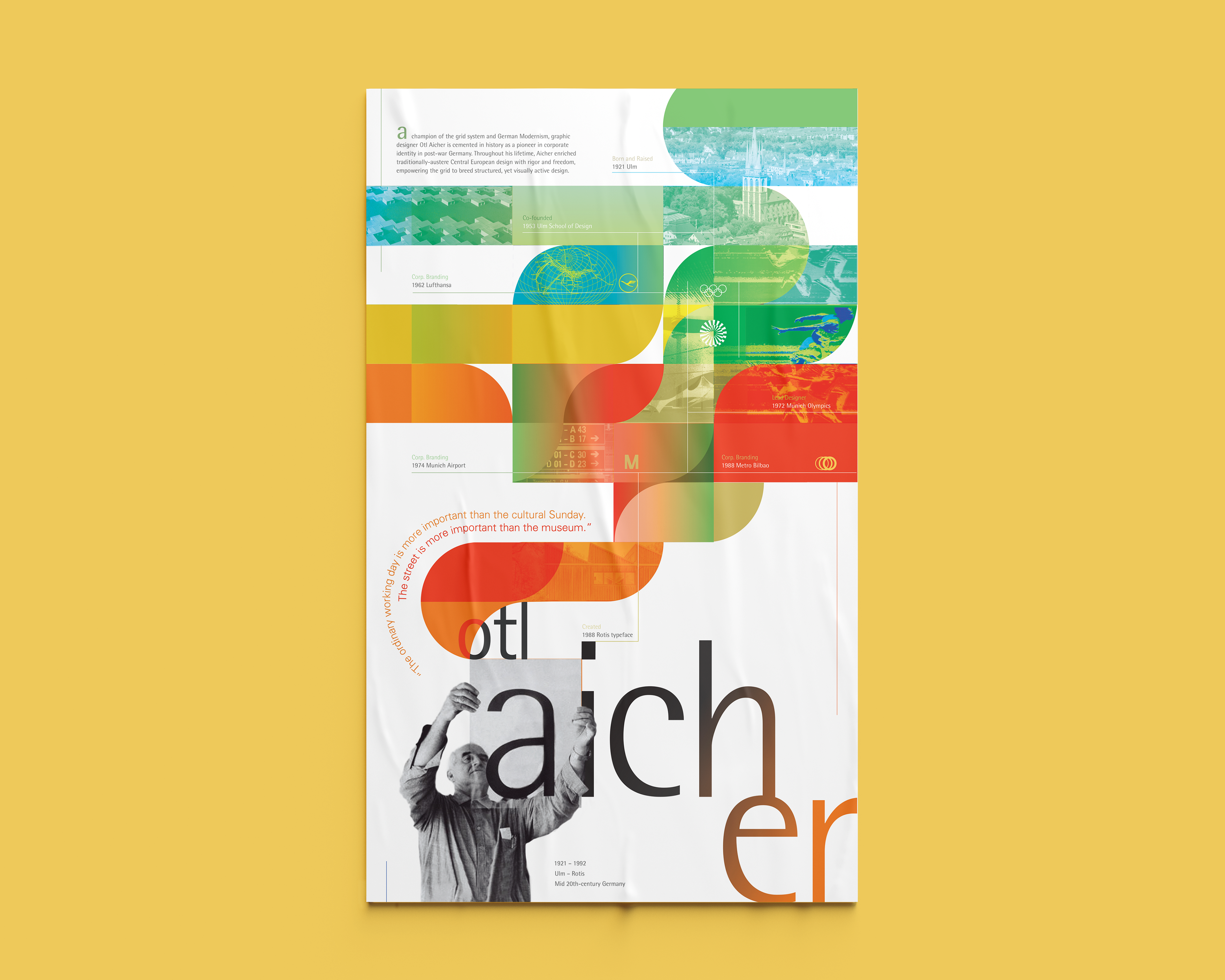
Informational POSTER
A reflection of graphic designer Otl Aicher’s strong use of grids and flat graphics in his rich portfolio of corporate branding work. This informational poster showcases the typeface he developed later in his life, Rotis, simultaneously teasing facets of his personal life and most notable corporate identity projects in the form of a timeline. Though Aicher’s design philosophy is utilitarian and "visually objective," the energetic and bright colors reflect his approach to revitalize his community in post-war Germany.
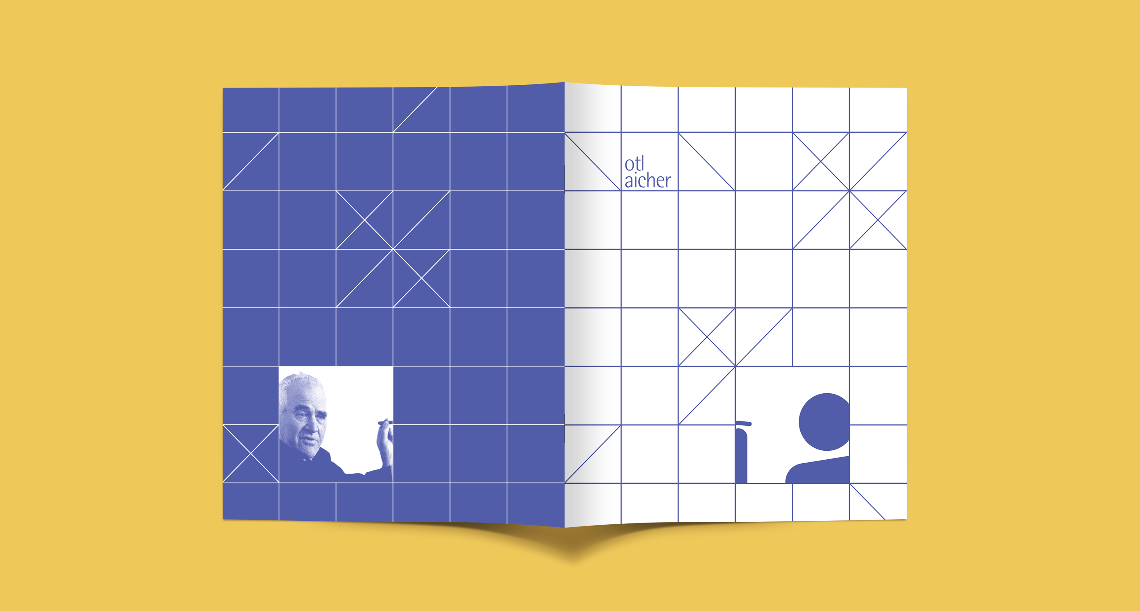
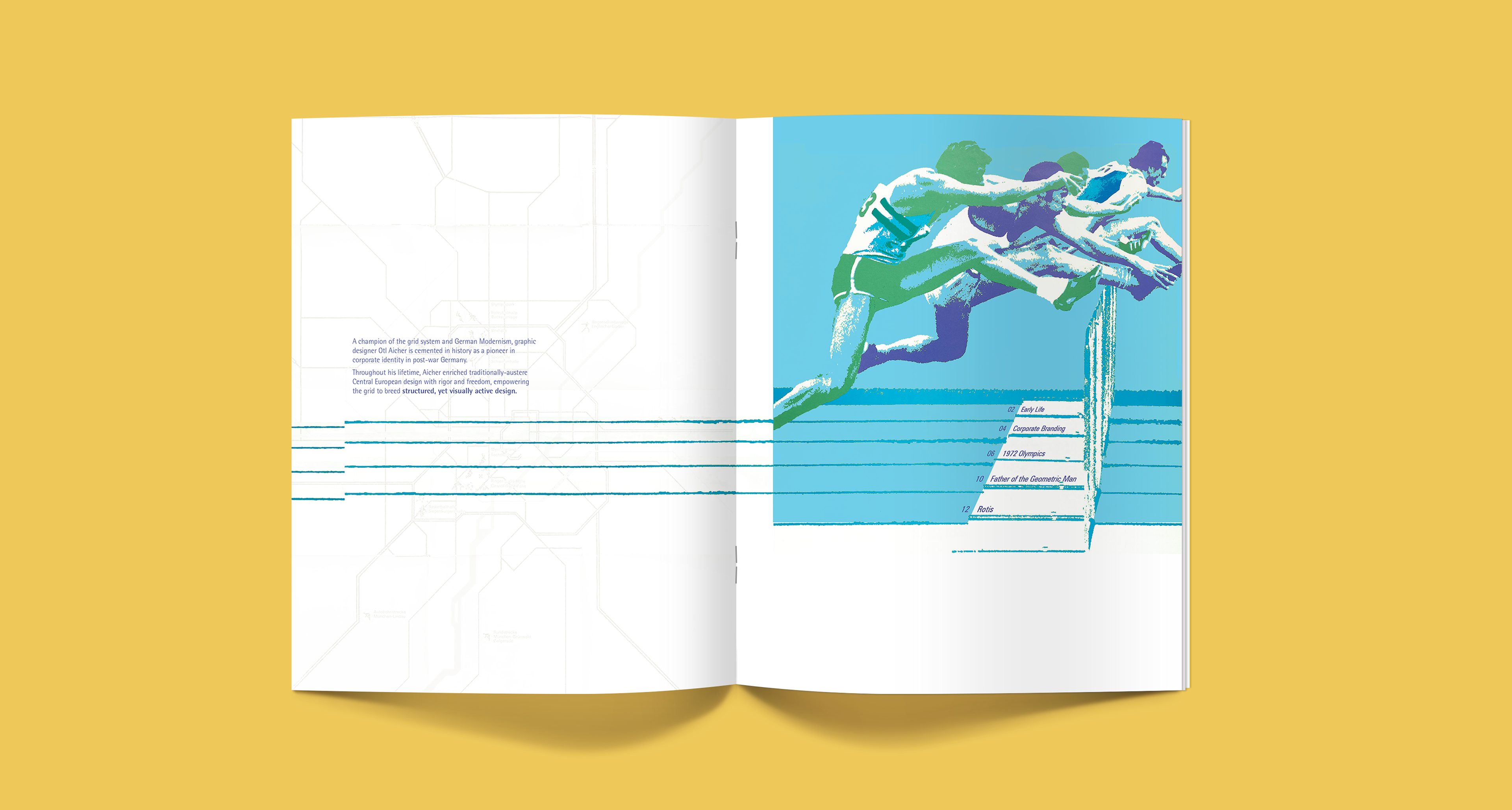
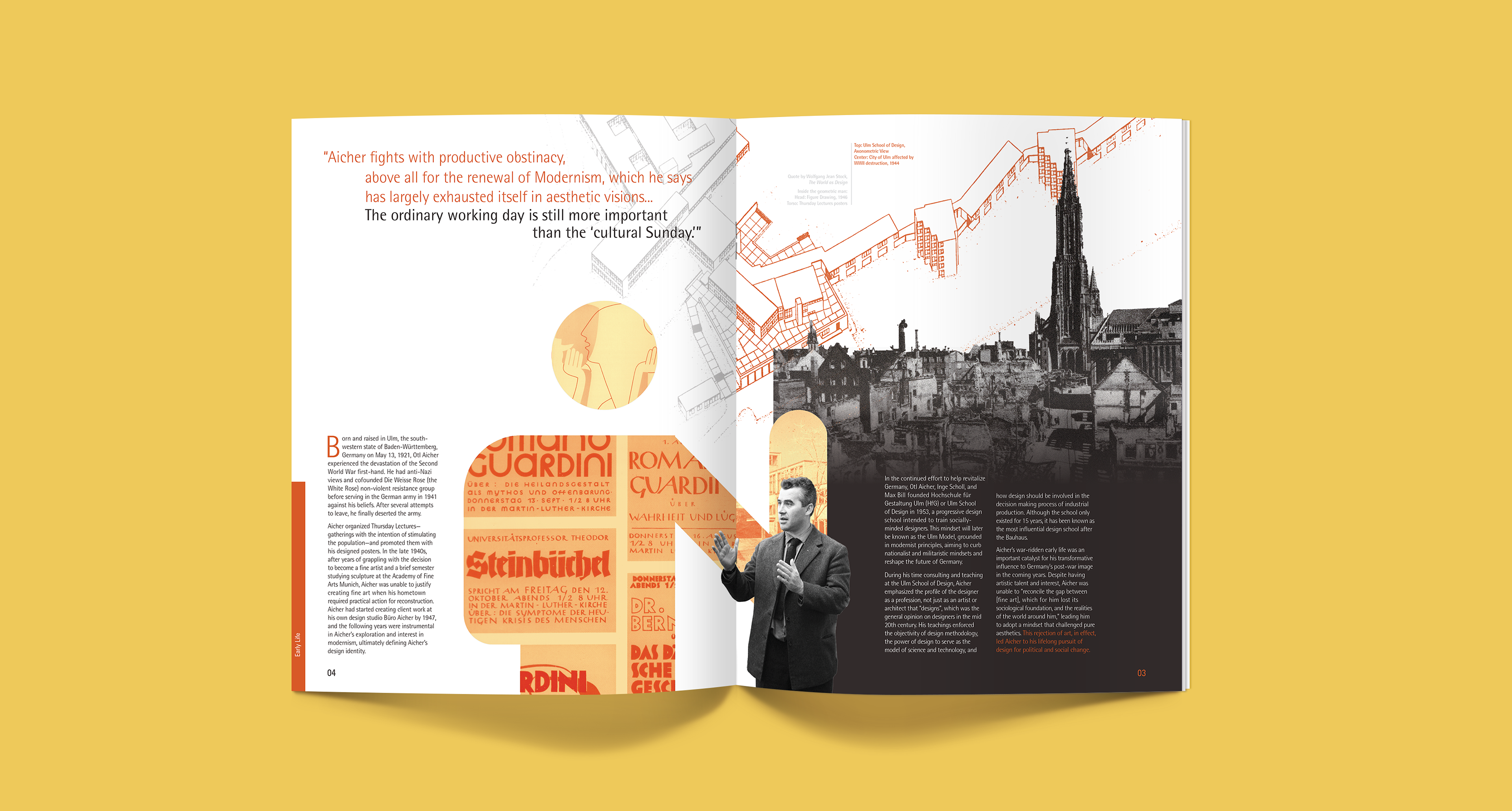
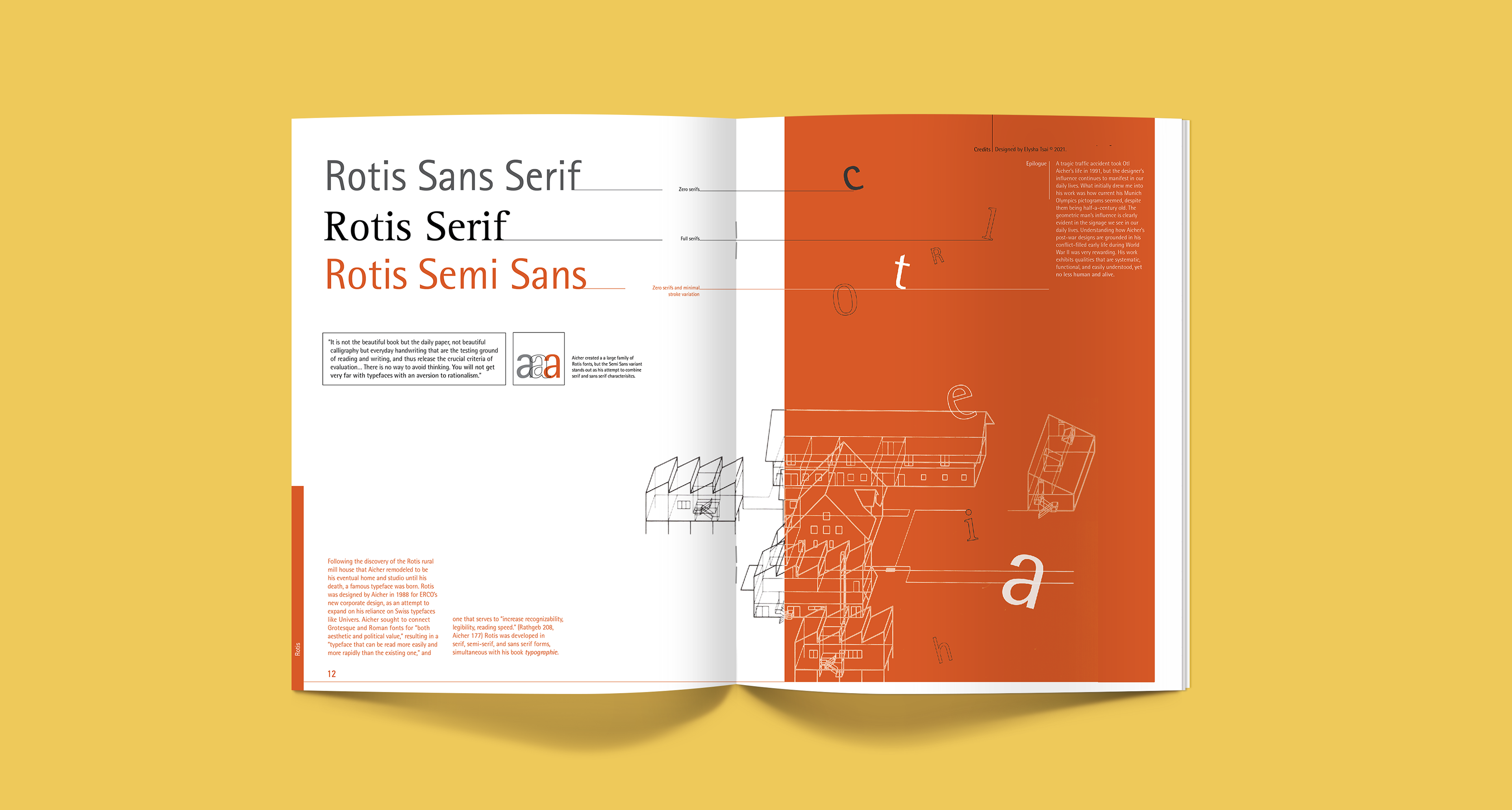
BOOKLET
A 16-page comprehensive overview of Otl Aicher's life, work, and design philosophy.
ANIMATION
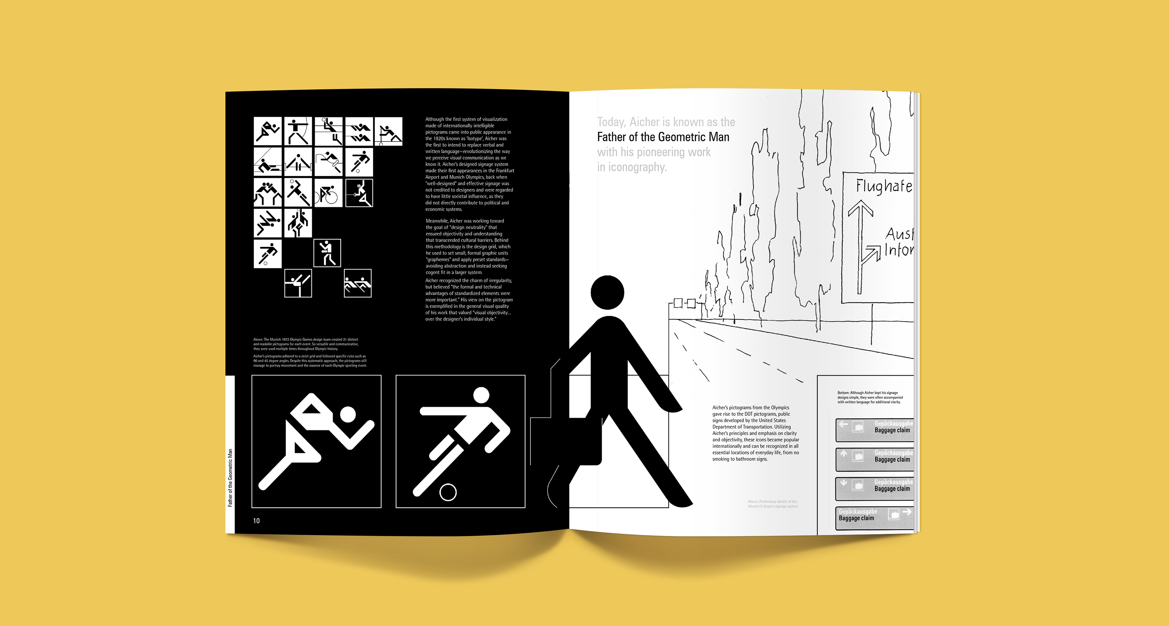
Although the first system of visualization made of internationally intelligible pictograms came into public appearance in the 1920s, known as ‘Isotype’, Aicher was the first to intend to replace verbal and written language—revolutionizing the way we perceive visual communication as we know it.
MOBILE EXPERIENCE